
Imagery
Our visual style portrays life at Ruhr University Bochum in a realistic and vibrant way. It showcases people and architecture from various perspectives and emphasizes collaborative learning, cultural diversity, and an inclusive community. You can find photo and video downloads in “Templates”.
At a Glance
Documentary Visual Style: We take photos and videos in a documentary style at events, functions, or similar occasions. The goal here is to capture moments authentically, without staging them.
These guidelines do not necessarily have to be followed for such shots. However, we expressly encourage following these guidelines.
Photography and Video for Internal and External Communication: When creating photos and videos for websites, social media, or other communication channels, we incorporate our visual style.This style makes the RUB instantly recognizable.
Three visual themes define our visual language.
Visual Theme 1: Closeness
Short communication channels, flat hierarchies, an open campus where people interact as equals—visually conveyed through short distances, half-length portraits, and situational scenes.


Visual Theme 2: Community
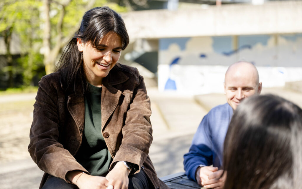
At RUB, change does not occur on an individual basis, but rather collectively—among people, disciplines, and cultures. This is reflected in the photography through a focus on groups, interaction, and exchange.


Visual Theme 3: Change of Perspective
Breaking down barriers, challenging existing perspectives, and opening up new paths. Visually, we convey this through unusual angles, deliberate framing, and the interplay between people and campus architecture.


To visually convey
Visually conveying “intimacy”
We create a sense of closeness and belonging through shots taken from various perspectives. We purposefully use half-portraits, upper-body shots, and close-ups to achieve an authentic and personal visual impact. We depict individuals in lively situations. One stylistic technique is to have other people appear out of focus in the foreground or background, or to portray the subject as a staged portrait. In both cases, we prioritize naturalness and an effortless, unforced effect.


Incorporating Interesting Perspectives and Architecture
We showcase Ruhr University Bochum as a dynamic and vibrant campus. Architecture is a central design element and is deliberately integrated into the photography. Unusual angles and deliberate framing create exciting perspectives. As a result, the images appear distinctive and vibrant, conveying the campus’s unique atmosphere.


Collaborative Learning
We showcase authentic and vibrant scenes of collaborative learning, exploration, and social interaction. Movement, conversations, and genuine moments take centre stage. Depth is a central element of the visual language. It is created through the deliberate use of foreground and background blur—for example, by intentionally blurring hands, shoulders, or objects in the foreground. This gives the images a multi-layered, lively, and natural feel.


Exposure
We prefer natural sunlight and avoid flat, diffuse lighting conditions. Side lighting or backlighting is ideal, especially in the morning and evening hours, to create warmth and depth. We avoid harsh midday sun. Instead, we work in the shade with clear lighting direction. Indoors, we use the strongest possible window light with a clear direction of light and avoid gloomy scenes with low contrast. The images are deliberately exposed slightly brighter to achieve a friendly and open effect. Skin tones serve as a guide for exposure.


Dos and Don’ts
The following examples show best practice and what to avoid.

An authentic, natural perspective
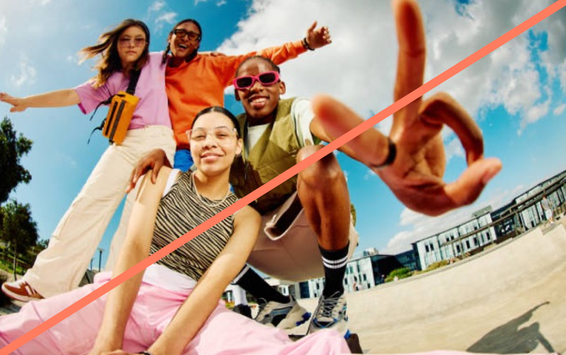
Extreme perspectives like fisheye

Overexposed light or extreme backlighting

Natural light and shadows
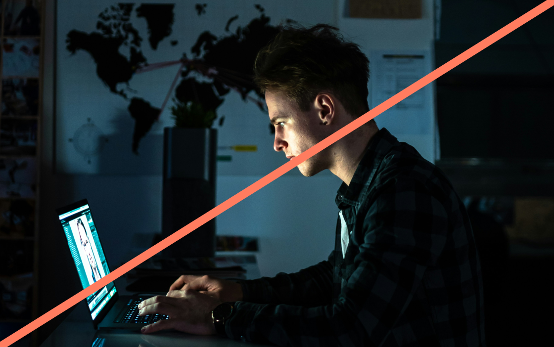
Very dark images
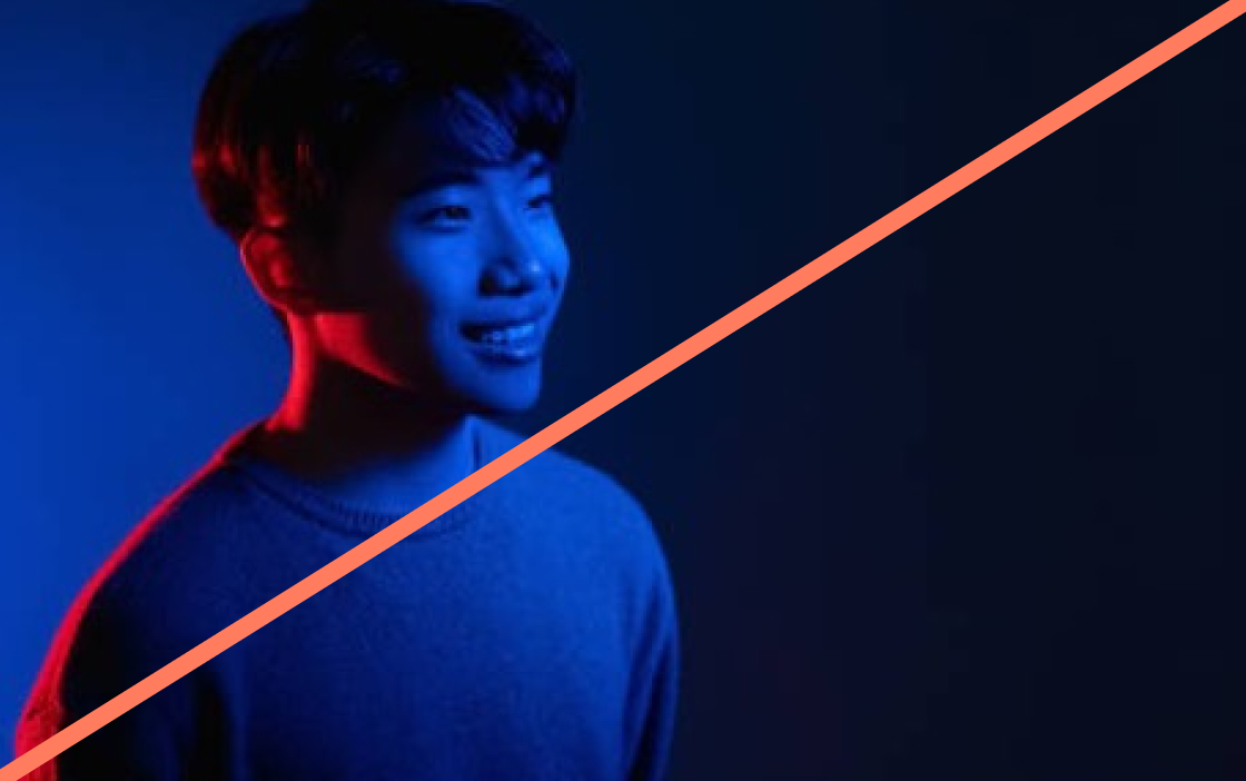
Deliberately artificial-looking light

Capture situations, encounters, and moments that feel genuine and unstaged

Avoid overly dramatic gestures, poses, or staged arrangements

Use saturated colour blocks in designs—they work best with natural photo colours

The images should not feature overly dominant color accents or solid color areas. These make it more difficult to incorporate them into a design.